
Tim Daddio
9 min read
12th Aug 2026
Contents
- First impression: does this feel like the school?
- Can parents immediately understand who you are?
- Can they find the important information without thinking?
- How quickly does the website actually load?
- Does it work properly on a phone?
- Is there an obvious next step?
- Does the website show real school life?
- A good website removes small doubts
- Your digital front door deserves the same attention as the real one
- What impression is your school website making?
A prospective parent arrives on your website for the first time. They may have found you through Google, followed a recommendation, clicked through from an advert or opened your site alongside four other schools they are considering.
Within a few moments, they are already forming an impression.
They probably have not read your educational philosophy, explored the curriculum or discovered the impressive new science building. They are making quicker judgements first. Does the school look credible? Does the website feel current? Can they immediately understand what kind of school it is? Can they find what they need without having to excavate the navigation menu?
None of these decisions is necessarily conscious, but they matter because the website is often the first real experience a family has of the school. Long before the open day, prospective parents have already walked through a digital version of the front door.
In that sense, your website is the open day they attend before the open day.
First impression: does this feel like the school?
Independent schools understandably care about presentation. Parents are making a significant emotional and financial decision, and the website should give them confidence that the organisation behind it is thoughtful, professional and well run.
That does not mean every school website needs enormous drone footage, elaborate animation and a film score that suggests Year 7 registration is about to become a major motion picture.
It does need to feel considered.
Photography should be strong and recent. Typography should be clear. Pages should look as though somebody is still responsible for them. The visual identity should reflect the character of the school rather than following whichever website trend was fashionable when the site was commissioned.
Most importantly, the experience should feel authentic. A small, warm preparatory school should not need to present itself like an international luxury brand. A highly academic senior school should still show the people and everyday experiences behind the results.
Good school website design does not simply make an organisation look impressive. It helps families recognise what makes it distinctive.
Can parents immediately understand who you are?
Schools often know themselves so well that they underestimate how little a first-time visitor knows.
A parent may land on the homepage with only a name, a location and perhaps one recommendation from a friend. They should not have to work through several pages of carefully polished copy before discovering whether the school is day or boarding, co-educational or single-sex, selective or non-selective, or which ages it serves.
The homepage should establish the basics quickly while also communicating something more meaningful about the school.
This is where generic language becomes particularly unhelpful. Almost every school can claim to be nurturing, ambitious, inclusive and committed to helping every child fulfil their potential. The problem is not that those things are untrue. It is that they do very little to help a parent distinguish one school from another.
Specificity is far more persuasive. Show what small class sizes make possible. Explain how the pastoral system works. Demonstrate what a strong music programme actually involves. Let families see the breadth of sport, drama, trips, clubs and ordinary school life.
Parents should leave the homepage with more than a pleasant impression. They should begin to understand why this school might suit their child.
Can they find the important information without thinking?
Beautiful websites can still be surprisingly hard to use.
School structures are complicated, and that complexity has a habit of finding its way into navigation. Departments, phases, academic programmes, pastoral systems and internal terminology may all make perfect sense to somebody who works at the school but considerably less sense to a parent visiting for the first time.
The navigation should be organised around what families are trying to discover rather than the school’s internal structure.
Admissions, fees, term dates, curriculum, pastoral care, learning support, transport, boarding and contact information should not require detective work. Neither should the next obvious step, whether that is booking an open morning, requesting a prospectus or contacting admissions.
A useful test is to give the website to somebody who does not know the school and ask them to find three or four common pieces of information. Do not help them. The moments when they hesitate, go backwards or ask what something means are often more useful than another internal meeting about the menu structure.
How quickly does the website actually load?
The most elegant homepage in the sector is not especially useful while a parent is staring at a blank screen.
Large images, autoplaying video, unnecessary effects and poorly optimised pages can make school websites slow, particularly on mobile connections. That matters because families are unlikely to conduct all their research from a large desktop computer in ideal conditions. They may be browsing on a phone while commuting, waiting outside an activity or sitting on the sofa after somebody has finally gone to bed.
Speed is part of the experience.
This does not mean stripping away everything visually interesting. Video, photography and animation can all help bring a school to life when they are used carefully. The aim is simply to make sure they support the journey rather than obstruct it.
If the homepage takes too long to appear, the first thing parents learn about the school may be that its website is irritating.
Does it work properly on a phone?
Mobile-friendly should mean more than technically fitting onto a smaller screen.
Buttons need to be easy to press. Text needs to be readable. Forms should not require endless zooming and scrolling. Menus should be straightforward, and important information should not disappear because the desktop design relied on somebody hovering a mouse over it.
Admissions forms deserve particular attention. Asking a parent to complete an unnecessarily long form on a phone creates friction at exactly the moment the school wants them to take action.
The same applies to open-day bookings. If somebody has reached the point of wanting to visit, the website should make that decision easy to complete. Clear dates, useful information and a short, reliable booking process are more valuable than an elaborate form collecting information nobody will use.
Is there an obvious next step?
School websites can contain enormous amounts of useful information while still leaving visitors unsure what to do next.
A parent may be interested but not yet ready to apply. They might want to book an open morning, download a prospectus, ask about learning support or simply speak to admissions. Different families will be at different stages, so the website needs clear routes rather than one enormous APPLICATIONS button appearing on every page.
Calls to action should feel relevant to where somebody is in the journey.
A page explaining boarding might lead naturally to a boarding visit or conversation with admissions. A sixth-form page might point towards an open evening. A page about learning support could provide an obvious route to speaking with the relevant team.
The objective is not to cover the website in buttons. It is to make the next sensible action easy to see.
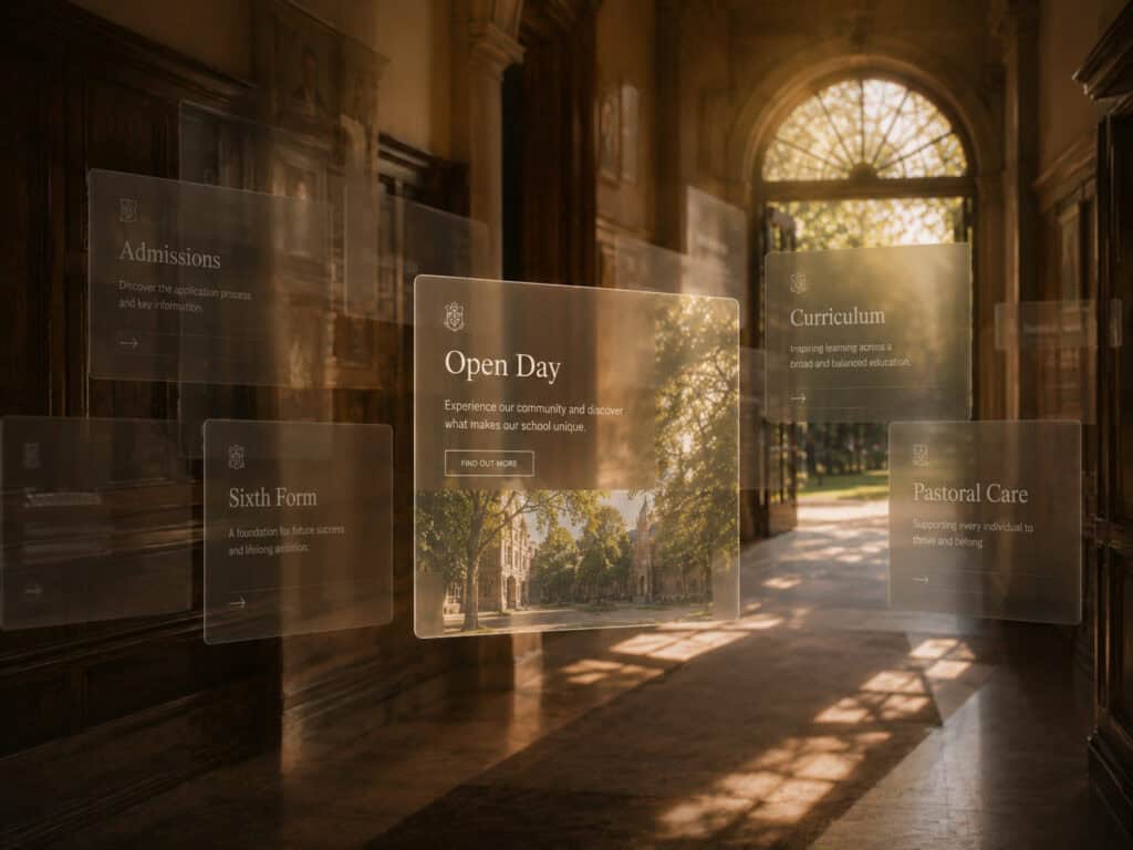
Does the website show real school life?
Parents expect polished photography, but increasingly they also want a more believable sense of what happens between the prospectus moments.
Video can be particularly useful here. Short pupil interviews, classroom clips, performances, sports footage and simple tours can communicate atmosphere quickly and give families access to parts of school life that may be difficult to show through text alone.
This does not require turning every pupil into a content creator or broadcasting the entire school day online. Safeguarding considerations rightly shape what schools can publish, and content needs to be planned carefully.
The strongest material tends to be purposeful. It helps answer a question, demonstrate an aspect of the school or give families a clearer picture of the experience their child might have.
Parents are not necessarily looking for the most cinematic school website. They are looking for signs that the people and experiences behind the marketing are real.
A good website removes small doubts
Most families will not reject a school because one button is slightly awkward or a photograph is a year out of date. Problems arise when those small points accumulate.
The website is slow. The fees are difficult to find. The mobile menu is confusing. The photography feels old. The open-day page is buried. The copy sounds almost identical to three competitors. The parent cannot quite work out what makes the school different, and another tab is already open beside it.
Each issue adds a little uncertainty.
A strong school website does the opposite. It steadily removes uncertainty by making the school easier to understand, easier to trust and easier to explore.
That is why website design is not simply a branding exercise. It is part of admissions.
Your digital front door deserves the same attention as the real one
Schools spend enormous time preparing for visiting families. Reception looks immaculate, pupil guides are briefed, displays are refreshed and everybody knows that the experience of arriving matters.
The website deserves similar attention because, for many families, it is where arrival actually happens.
Parents should be able to recognise the character of the school, understand what makes it different, find the information that matters and move naturally towards a visit or conversation. If the website makes those things difficult, some families will never reach the stage where the admissions team has an opportunity to change their minds.
The aim is not to impress somebody for five seconds and declare the job finished. It is to make those first few seconds good enough that they want to spend another five minutes discovering more.
What impression is your school website making?
Rebellion helps independent schools create websites that look distinctive while also working harder as part of the admissions journey.
We can review the design, structure, speed, content and user journey of an existing school website, identify where prospective families may be encountering unnecessary friction and help create clearer routes from initial interest to open-day bookings and enquiries.
Because your website should do more than look good in a governors’ meeting. It should make the right families want to keep looking.
Latest news

9 min read
2nd Sep 2026
LinkedIn Isn’t a Megaphone: How Firms Actually Win Work There
LinkedIn can create a slightly misleading impression of what business development looks like. Open the feed and there is no shortage of activity. Firms announce new hires, congratulate colleagues, share awards, publish articles, celebrate office anniversaries and occasionally reveal that the entire team spent Friday afternoon building a raft for...
Tim Daddio
Read article
9 min read
26th Aug 2026
Winning the “Independent School Near Me” Search: Local SEO for Schools
For independent schools, visibility is often local before it is anything else. Here’s how to make sure your school appears when nearby families start searching. For many parents, the search for a school begins before they know the name of the school they are looking for. They are searching for...
Tim Daddio
Read article
9 min read
20th Aug 2026
Your Website Gets Traffic but No Enquiries, Here’s Why.
Getting more people to your website is usually treated as a good thing, and in most cases it is. SEO is working, campaigns are generating clicks, people are finding the business and the traffic graph is moving in the right direction. The problem comes when none of those visitors actually...
Tim Daddio
Read article
9 min read
12th Aug 2026
What Parents Judge in the First 5 Seconds on Your School Website
A prospective parent arrives on your website for the first time. They may have found you through Google, followed a recommendation, clicked through from an advert or opened your site alongside four other schools they are considering. Within a few moments, they are already forming an impression. They probably have...
Tim Daddio
Read article