

Rebellion Marketing
18 min read
10th Jul 2024
Contents
- The Power of Colour Theory in Branding
- The Foundations of Colour Theory
- Emotional Impact and Colour Psychology
- Colour in Marketing and Brand Identity
- Navigating Colour Schemes
- The Colour Wheel: A Crucial Tool for Designers
- Applying Colour Theory to Digital Platforms
- Historical Influence and Theorists
- The Science of Colour: Models and Systems
- In-Depth Look at Colour Properties
- Creating Cohesive Colour Palettes
- Frequently Asked Questions
Colours aren’t just for show—they spark emotions, shape perceptions, and drive actions.
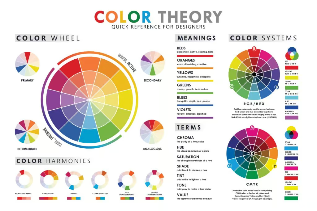
This straightforward guide covers the essentials of colour theory, arming you with the know-how to use colours effectively in your branding. From grasping primary colours to mastering complementary schemes, you’ll learn how to make smart colour choices that make your brand pop and resonate with your audience. Get ready to revolutionise your marketing with the power of colour.
The Power of Colour Theory in Branding
As we dive into the essentials of colour theory you’ll discover how primary colours—red, blue, and yellow—form the base for all other colours. With the colour wheel, you can create appealing and effective colour schemes.
Brands often use white to symbolise cleanliness and simplicity, giving a fresh and creative vibe, but colours do more than look good—they shape your brand’s identity. Red can evoke excitement, blue conveys trust, and each colour has its unique impact.
This guide will show you how to apply these principles across digital platforms, making your marketing materials both compelling and cohesive.
Key Takeaways
- Colour choices in marketing can evoke specific emotions and influence behaviour.
- Primary colours are the foundation of all other colours in the colour wheel.
- Understanding colour psychology helps in building a strong brand identity.
The Foundations of Colour Theory
Understanding colour theory and using it properly can mean the difference between fading into the background or standing out and grabbing attention. It’s absolutely key for creating effective marketing materials.
Mastering primary, secondary, tertiary, and complementary colours will help you design visually appealing and emotionally impactful content.
Understanding Primary and Secondary Colours
Primary colours are red, blue, and yellow. These are the most basic colours and cannot be made by mixing other colours. They are the building blocks of all other colours.
Secondary colours are created by mixing two primary colours. They include green, orange, and purple. For instance, mixing blue and yellow makes green, red and yellow make orange, and blue and red make purple. This foundation is essential for creating a strategic colour palette.
Exploring Tertiary and Complementary Colours
Tertiary colours result from mixing a primary colour with a secondary colour. Examples include red-orange, blue-green, and yellow-green. They add depth and complexity to your palette and can be found on the colour wheel.
Complementary colours are opposite each other on the colour wheel. They create high contrast and make each other stand out. For example, red and green or blue and orange. Using these colours wisely can make your designs more vibrant and eye-catching, enhancing your marketing message.
Emotional Impact and Colour Psychology
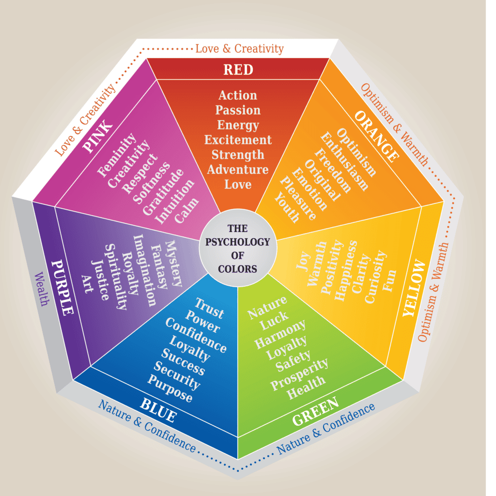
Colour plays a vital role in marketing by influencing emotions and behaviours. Colours can attract attention and evoke specific feelings, making them powerful tools for brands to connect with consumers.
Harnessing Colour for Emotional Response
Believe it or not, colours have a direct impact on your mood, emotional responses and even trigger physical responses. For instance, red can increase your heart rate and create a sense of urgency, making it ideal for clearance sales. Blue, on the other hand, is calming and promotes trust, which is why it’s used A LOT by financial institutions.
Yellow is associated with happiness and energy (think Inside out’s Joy character!) but can also be overwhelming if overused. Green is linked to health and tranquillity, often used by eco-friendly brands. Black conveys luxury and sophistication, while white symbolises purity and simplicity.
Using the right colours helps your brand communicate effectively with your audience. Neil Patel notes that 85% of consumers make purchasing decisions based on colour. Full-colour ads are also recognised 26% more often than black and white ones (source).
Cultural Symbolism and Colour Perceptions
Colours can have different meanings across cultures. In Western cultures, white is often linked to purity and weddings, but in some Asian cultures, it’s associated with mourning and funerals. Red symbolises good luck in China, while in Western countries, it can signify danger or love.
Blue is viewed as a colour of masculinity in Western cultures but represents femininity in China. Yellow can mean hope in some cultures, while in others, it can signify cowardice. These cultural differences are so important to remember for global marketing campaigns as you can imagine!
It’s also important to consider personal preference. While some may find purple luxurious and wise, others might see it as overly dramatic. Understanding these nuances ensures your message resonates universally, avoiding potential missteps in your marketing.
Using these insights, you can create more effective and culturally sensitive marketing strategies that appeal to a global audience.
Colour in Marketing and Brand Identity

Understanding how colours affect perception and emotions is key when designing a brand’s identity. The right mix of dominant, background, and accent colours can make or break your branding efforts.
Dominant Colours and Brand Recognition
Your brand’s dominant colour is the most significant, as it’s often what people remember first. Think of Coca-Cola’s red or Facebook’s blue. These colours are not chosen at random; they are selected to evoke emotions and convey specific messages.
Red can evoke excitement and urgency, making it ideal for sales and clearance events. Blue, on the other hand, exudes trust and professionalism, often used by tech companies and financial institutions.
Choosing the right dominant colour involves considering your target audience’s preferences and cultural associations. As we’ve already learnt, white is associated with purity in Western culture but may represent mourning in some Asian cultures.
Ensure that your background colours and accent colours complement your dominant colour. These secondary colours should enhance your primary message without distracting from the brand’s core identity. Graphic designs and advertisements should consistently use these chosen colours to create a cohesive and memorable brand identity.
For further reading, explore this guide on color theory in brand identity designs.
Navigating Colour Schemes
Colour schemes are fundamental in creating visually appealing and effective marketing materials. Choosing the right colours can evoke emotions, enhance brand recognition, and influence consumer behaviour.
Analogous and Complementary Schemes
Analogous colour schemes use colours that are next to each other on the colour wheel. These colours usually match well and create serene and comfortable designs. Using analogous colours, like blue, green, and teal, can make your marketing materials look cohesive and visually appealing.
In contrast, complementary colour schemes use colours that are opposite each other on the colour wheel. This creates a high-contrast and vibrant look. Red and green, or blue and orange, are classic examples of complementary colours. These schemes can make certain elements stand out, drawing attention to specific parts of your design. Complementary colours can be bold, so use them sparingly to avoid overwhelming your audience.
Brands Using Analogous and Complementary Colour Schemes
Analogous Colour Schemes
- PepsiCo: Utilises blue, teal, and green shades across various products and marketing materials to create a harmonious and cohesive look.

2. Starbucks: Employs deep green in their branding, giving a calming and natural aesthetic.

Complementary Colour Schemes
- FedEx: Uses orange and purple, which are opposite each other on the colour wheel, creating a vibrant and eye-catching brand identity.

2. Fanta: Combines blue and orange in its packaging and marketing, making the design pop and stand out.

Triadic and Monochromatic Explained
A triadic colour scheme involves three colours that are evenly spaced around the colour wheel. This scheme offers a vibrant, yet balanced look. For instance, using red, yellow, and blue can make your design lively and dynamic. Triadic schemes provide high contrast, but they remain harmonious, making them ideal for designs that need both balance and a pop of colour.
Brands Using A Triadic Colour Scheme
Burger King
Burger King uses a triadic colour scheme with red, yellow, and blue. This combination creates a vibrant and dynamic brand presence. The use of these evenly spaced colours from the colour wheel offers high contrast while maintaining harmony, making the design lively and memorable. This scheme helps Burger King stand out and reinforces its energetic and playful brand identity.

Monochromatic colour schemes use varying shades, tints, and tones of a single colour. This approach creates a cohesive and minimalist look. For example, using different shades of blue can provide depth and interest without the clutter of multiple colours. Monochromatic schemes are excellent for creating a clean and elegant design, allowing your message to remain clear and focused.
By carefully selecting and combining these colour schemes, you can enhance your marketing materials and make a more significant impact on your audience. Understanding how to navigate these schemes will help you create designs that resonate with your target audience and effectively convey your brand message.
Monochromatic Colour Scheme Example
Tiffany & Co.
Tiffany & Co. uses a monochromatic colour scheme featuring various shades, tints, and tones of their signature “Tiffany Blue.” This approach creates a cohesive and minimalist look, providing depth and interest without the clutter of multiple colours.
The consistent use of different shades of blue allows Tiffany & Co. to maintain a clean and elegant design, ensuring their brand message remains clear and focused. This strategy enhances their marketing materials, making a significant impact on their audience.

The Colour Wheel: A Crucial Tool for Designers

Understanding the colour wheel is a must for effective design. It helps you create visually appealing combinations by leveraging the relationships between colours and selecting hues that evoke specific emotions.
Decoding the Colour Wheel
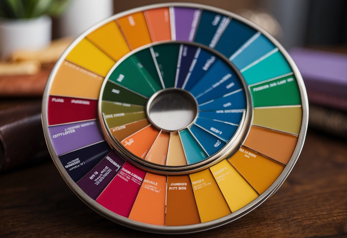
The colour wheel is a circular diagram that illustrates the relationships between primary, secondary, and tertiary colours. Primary colours—red, blue, and yellow—cannot be created by mixing other colours. Secondary colours—green, orange, and purple—are formed by mixing two primary colours. Tertiary colours come from mixing a primary and a secondary colour next to it on the wheel.
Designers use the colour wheel to explore a colour gamut, the range of colours that can be combined effectively. By understanding these relationships, you can create harmonious colour schemes. Complementary colours are opposite each other on the wheel and create high contrast. Analogous colours sit next to each other and provide a more harmonious effect.
Warm versus Cool Colours
Warm colours, like red, orange, and yellow, evoke feelings of warmth and comfort. They are often used to grab attention and convey energy and passion. These colours are typically associated with action and excitement.
Cool colours, such as blue, green, and purple, evoke calmness and tranquillity. They are great for creating a sense of peace and professionalism. Cool colours are often used in corporate environments to instil confidence and trust.
Choosing between warm and cool colours depends on the emotion you want to evoke in your audience. For example, a health spa might lean towards cool colours to promote relaxation, while a fast-food restaurant might choose warm colours to stimulate appetite and energy.
Applying Colour Theory to Digital Platforms

In digital platforms, the strategic use of colour can significantly enhance user experience and engagement. Understanding how to apply colour theory in web and app design, and leveraging tools like Adobe Color, can give you a competitive edge.
Effective Use of Colour in Web and App Design
When designing websites and apps, colour design principles should really be considered. Colours not only attract attention but also influence users’ emotions and actions. For example, blue is often used to build trust and calmness, while red can create a sense of urgency.
- Contrast is important for readability. Make sure text and background colours have enough contrast, this is particularly important for accessibility.
- Consistency is key. Stick to a restricted colour palette to maintain brand identity.
- Accessibility matters. Ensure your colour choices are considerate of those with colour blindness.
According to the Interaction Design Foundation, understanding your audience’s cultural background is also important. Different cultures associate different meanings with colours, which can affect how your message is received.
Leveraging Tools like Adobe Color
Tools like Adobe Color make it easier to choose the right colour schemes for your projects. Adobe Color allows you to explore and save various colour palettes.
- Colour wheel and Harmony Rules: Use the colour wheel to create complementary, analogous, or monochromatic schemes.
- Accessibility tools: Check for colour contrast and accessibility issues directly within Adobe Color.
- Ease of integration: Import your palettes directly into Adobe Creative Cloud apps like Photoshop and Illustrator.
These features help you maintain a consistent and effective colour scheme throughout your design. Adobe Color streamlines the process of applying colour theory, making it easy to test and iterate different palettes before finalising your design. This ensures a seamless and visually appealing user experience.
Historical Influence and Theorists

Understanding the roots of colour theory gives you insights into why certain colours evoke specific emotions and how different theorists shaped these ideas. This section covers the major contributors to colour theory from historical and modern times.
From Newton to Goethe: Evolution of Colour Theory
The journey of colour theory begins with Isaac Newton in the 17th century. Newton discovered that white light could be split into a spectrum of colours using a prism. This was groundbreaking and laid the foundation for future studies.
In the 19th century, Johann Wolfgang von Goethe expanded on Newton’s ideas. Unlike Newton, Goethe focused on how colours affect our emotions, introducing the notion of colour harmony. He argued that colours have psychological impacts and explored how they interact with each other.
Arthur Schopenhauer later built upon Goethe’s work. He agreed with Goethe about the emotional effects of colours and delved deeper into the interaction between colours. This progression from Newton to Goethe and Schopenhauer shows how scientific and emotional analyses combined to form a comprehensive understanding of colour.
Modern Colour Theory and Its Pioneers
Modern colour theory was further developed in the 20th century. Johannes Itten, for example, was a significant figure who contributed to the Bauhaus movement. He identified principles like primary, secondary, and complementary colours, which became standard teachings in art and design.
Michel Eugène Chevreul was another 19th-century pioneer whose work on the colour wheel remains influential. He studied how colours affect each other when placed side by side, a principle known as simultaneous contrast. Chevreul’s ideas are still used in modern design and marketing to create visually appealing and effective colour schemes.
In recent years, colour theory has advanced with more scientific accuracy in measuring light spectrums. This has allowed marketers to use colour with greater precision, enhancing brand recognition and emotional impact. You can utilise these modern principles to make informed choices in your marketing strategies.
The Science of Colour: Models and Systems
Understanding colour in marketing involves diving into the additive and subtractive models, as well as the colour spectrum that affects human perception. By exploring these concepts, you’ll gain a strategic edge in your marketing efforts.
Understanding Additive and Subtractive Models
In the additive colour model, light is combined to create colours. Primary colours in this model include red, green, and blue. When these colours mix, they form white light. This model is crucial in digital screens, where pixels combine these primary colours to display various hues.
On the flip side, the subtractive colour model works by subtracting wavelengths from white light. The primary colours here are cyan, magenta, and yellow. When combined, they absorb light, creating black. This model is often used in printing.
Understanding these models helps you better grasp how colours appear on different mediums, whether it’s a digital ad or a printed flyer.
Exploring The Colour Spectrum
The colour spectrum encompasses all the visible wavelengths of light, from red to violet. When you see a rainbow, you’re witnessing the full range of the colour spectrum. Each colour corresponds to a specific wavelength, with red having the longest wavelength and violet the shortest.
It’s vital to manipulate this spectrum in marketing. Warm colours like red and orange can evoke excitement and urgency, while cool colours like blue and green can create a sense of calm and trust. By harnessing the power of the colour spectrum, you can strategically influence your audience’s emotions and behaviour.
For more insights on colour theory, check out this guide on traditional colour theory. Understanding these principles can make your marketing materials more effective and appealing.
In-Depth Look at Colour Properties
Understanding the properties of colour can help you make better choices in your marketing strategy. You’ll explore how colour temperature, value, saturation, and brightness interact to create compelling designs.
Colour Temperature and Value
Colour temperature divides colours into warm and cool categories. Warm colours (reds, oranges, yellows) evoke energy and passion. Cool colours (blues, greens, purples) give a sense of calm and professionalism.
Colour value refers to the lightness or darkness of a colour. Dark colours can create a sense of depth and sophistication. Lighter colours often make spaces feel open and clean.
Knowing the value in your colour family can help you balance your design. High-value contrast can make key elements pop, while low-value contrast can provide a more subtle look.
Saturation and Brightness
Saturation measures the intensity of a colour. Highly saturated colours are vivid and can grab attention instantly. Low saturation colours appear muted and can convey elegance or tranquillity. Choosing the right saturation depends on the emotion you want to convey.
Brightness determines how much light a colour emits. Bright colours are eye-catching and can create a cheerful, energetic vibe. Darker colours are more reserved and can lend a sense of luxury or mystery.
Adjusting saturation and brightness allows you to play with colour effects, ensuring your design aligns with your brand’s voice and audience expectations.
Creating Cohesive Colour Palettes

To create cohesive colour palettes, you need to understand techniques that harmonise colours and follow guidelines for colour combinations. This helps ensure your branding and design are visually appealing and effective.
Colour Harmonisation Techniques
Colour harmonisation is all about creating visually pleasing combinations. The colour wheel is essential here. It includes primary, secondary, and tertiary colours.
Analogous colours are next to each other on the wheel. Using them creates a soft, natural look. For example, blue, teal, and green make a harmonious palette.
Complementary colours lie opposite each other on the wheel. They can make designs pop by providing high contrast. Red and green, for example, create a vibrant look.
Triadic colour schemes use three colours evenly spaced on the wheel. This ensures a balanced, yet colourful palette. Think of the primary colours—red, yellow, and blue.
Monochromatic schemes use different shades, tints, and tones of a single colour. This results in a cohesive and elegant look.
Guidelines for Colour Combination
Choosing the right colour combination involves several important guidelines:
- Limit the palette: Stick to three to five colours to avoid overwhelming your audience.
- Use a colour guide or colour atlas: These resources help you choose colours that work well together.
- Consider cultural meanings: Colours can have different meanings in various cultures. Make sure your choices align with your audience’s preferences.
- Contrast and readability: Ensure text contrasts well with the background for readability.
Tools like Klint Marketing’s Colour Theory Guide can be helpful in understanding how to apply these combinations effectively.
Applying these techniques and guidelines will make your colour palettes more cohesive and impactful.
Frequently Asked Questions
Colour theory plays a significant role in marketing, impacting consumer behaviour, brand trust, and overall strategy. The answers to these common questions offer practical insights into making informed decisions.
How does the psychology of colours impact consumer behaviour in marketing?
Colours can evoke emotions and influence how consumers feel about a brand. For example, red can create a sense of urgency and excitement, which is why it’s often used in clearance sales. Blue, on the other hand, tends to evoke trust and calmness, making it popular in corporate and tech branding.
Can you identify the most effective colours for brand trust and reliability?
Blue is often regarded as the most effective colour for establishing brand trust and reliability. Financial institutions and tech companies frequently use blue to communicate stability and security. Similarly, green is associated with health, wellness, and eco-friendliness, making it a strong choice for brands in those sectors.
What are the seven core colour schemes that every marketer should know?
Understanding the seven core colour schemes is essential for marketers:
- Monochromatic
- Analogous
- Complementary
- Split Complementary
- Triadic
- Tetradic
- Square
Each scheme offers unique ways to create visually appealing and cohesive designs.
Where should a novice begin when learning about colour theory in application to marketing?
Start with the basics of colour theory by learning about primary, secondary, and tertiary colours. Familiarise yourself with the primary colours: red, blue, and yellow. From there, study the psychological effects of different colours and experiment with simple projects to see how colour combinations work in practice.
How can I interpret a colour psychology chart to improve my marketing strategies?
A colour psychology chart can serve as a quick reference to understand what emotions and perceptions different colours evoke. Use it to match your brand’s values with the right colours. If you want to convey trust, for example, you might choose blue. For excitement and urgency, opt for red. This can guide your marketing materials, from logos to web design.
Standout examples of colour psychology used successfully in marketing campaigns.
Take Coca-Cola’s use of red, which stimulates appetite and creates urgency, perfect for enticing buyers. Another example is Apple’s use of white and black to symbolise simplicity and sophistication. These colour choices align with their brand’s ethos and target audience, showcasing how effective colour psychology can be.
Looking for a rebrand that wows? Let our team craft your perfect brand that speaks to your target market and gets your business moving.
Latest news

18 min read
30th Sep 2026
Beyond the Prospectus: Storytelling That Attracts the Right Families
Choosing a school is rarely about one thing. Facilities certainly matter, and parents will want to know about classrooms, sports pitches, theatres, boarding houses and laboratories. An impressive campus can help create confidence, but buildings alone rarely explain why one school feels right and another does not. Families are trying...
Rebellion Marketing
Read article

18 min read
21st Sep 2026
AI Search Optimisation: A Practical Guide (Minus the Mystical Nonsense)
AI search has moved the front door to your website, and nobody sent a change of address card! Someone asks ChatGPT which consultancy to shortlist, or types a question into Google and gets an AI-generated answer with three cited sources. Your brand is either in that answer or it isn’t....

Jade Arnell
Read article

18 min read
17th Sep 2026
Thought Leadership Without the Waffle: A No-Nonsense Guide for Firms
Few marketing phrases manage to sound as important and say as little as “thought leadership”. Professional services firms are routinely told they need more of it. Partners should become thought leaders. The website needs thought leadership content. LinkedIn needs a thought leadership strategy. Before long, somebody is suggesting a quarterly...
Rebellion Marketing
Read article

18 min read
9th Sep 2026
How AI Decides Which Schools to Recommend to Parents
A parent looking for a school used to begin with a fairly predictable Google search. They might type “independent schools near Oxford”, open several websites and gradually build a shortlist. Increasingly, there is another option. They can ask an AI system a much more specific question. “Which independent girls’ schools...
Rebellion Marketing
Read article